In search of a logo

Even something seemingly simple as a game logo requires a lot of though and discussion. This process usually involves starting out by creating a bunch of different versions that are then evaluated, discussed and dropped again. After drawing a shortlist, the best picks are then redesigned, improved, discussed and discarded again, until only one logo remains.
During these discussions, several aspects come into play:
- Does the logo properly represent the game's art direction?
- Is the logo readable in any size?
- Does it stay readable when placed in front of colorful artwork?
- Can it be reduced to a single (app) icon?
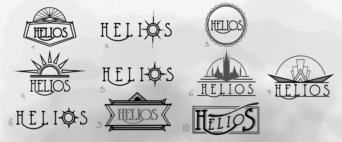
For Helios, we've explored many ways of embodying our Steampunk topic into our logo design. Now usually, players only know the final logo that remains after all other options have been kicked out. However, we believe that seeing the designs that never made it are just as interesting, which is why we share them with you.

First batch of logo designs

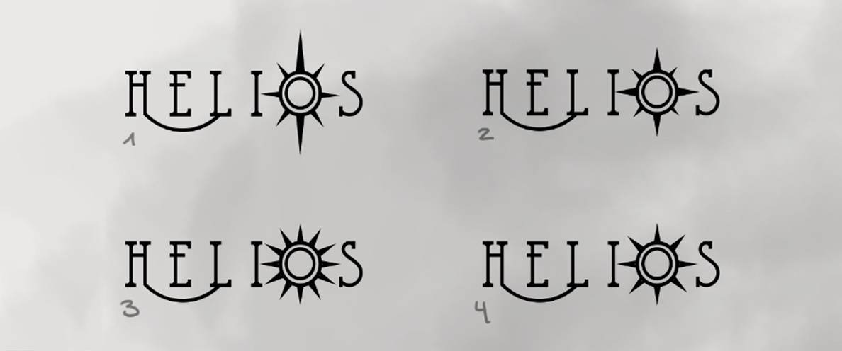
Detailed versions of our selection
What do you think? Would you have chosen a different design? If so, why?
Get Helios
Helios
City builder meets card game.
| Status | Released |
| Author | Oliver Leins |
| Genre | Strategy, Card Game, Puzzle |
| Tags | 3D, Atmospheric, Cute, Fantasy, Relaxing, Singleplayer, Top-Down |
More posts
- Developer Interview - Watch Now!Sep 12, 2019
- Passing One Last MilestoneAug 12, 2019
- Release - play Helios now!Aug 09, 2019
- Building an empireAug 07, 2019
- Helios Teaser TrailerAug 06, 2019
- Early Access: Update 4 OUT NOW!Aug 05, 2019
- Timelapse ChallengeJul 30, 2019
- Early Access: Update 3 OUT NOW!Jul 29, 2019
- Early Access: Update 2 OUT NOW!Jul 22, 2019
- Buildings Update: Beefing stuff up!Jul 16, 2019
Leave a comment
Log in with itch.io to leave a comment.